123
Brooklyn Commons
Once an overlooked 1980s office park, this property has been revitalized into a thriving, reimagined destination in the heart of the borough, a vibrant hub for work, community, and everyday life.
Placebranding
A brand that socializes architecture
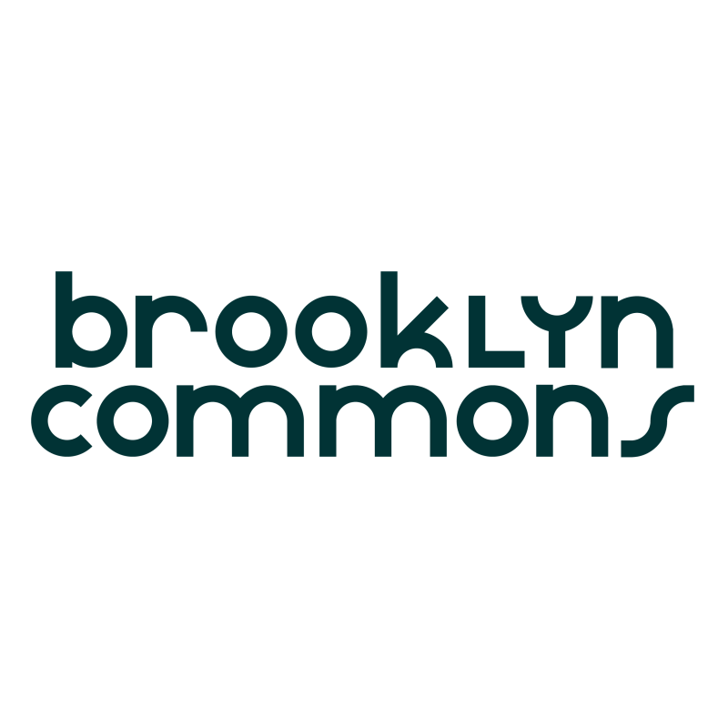
Long Form

Short Form
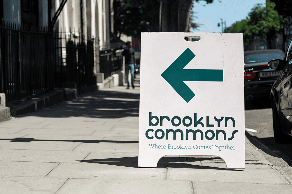
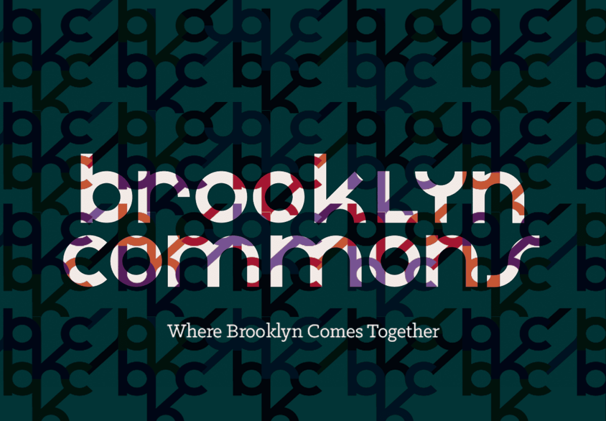
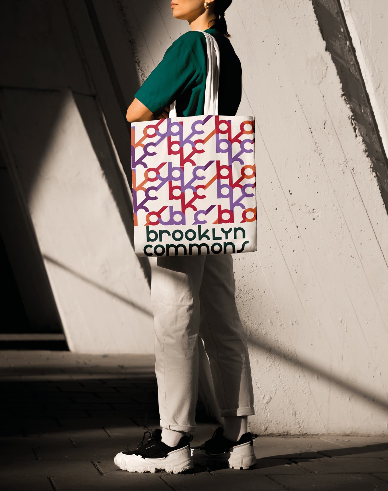
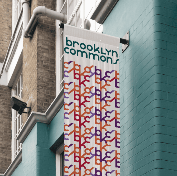
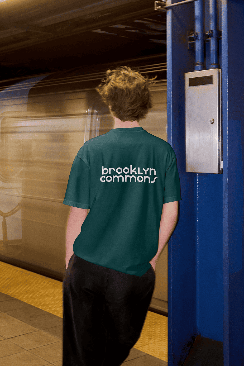
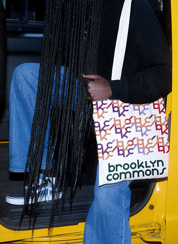
The identity was designed to be flexible and built to extend, mirroring the property's role as a connector to all major parts of downtown Brooklyn.
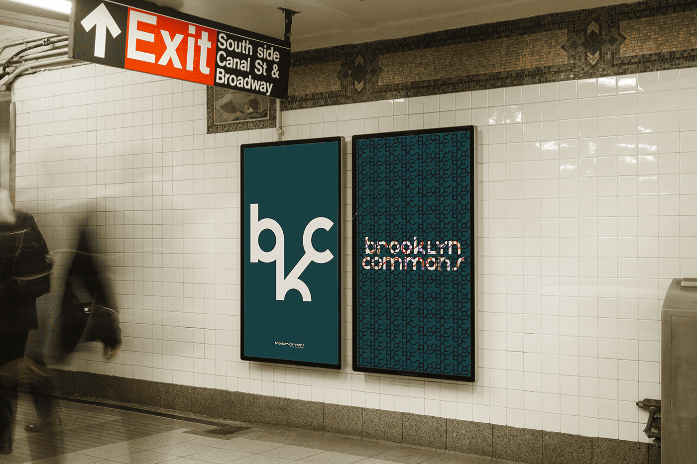
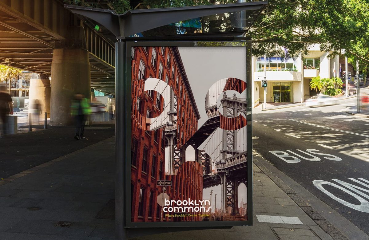
OOH Advertisements
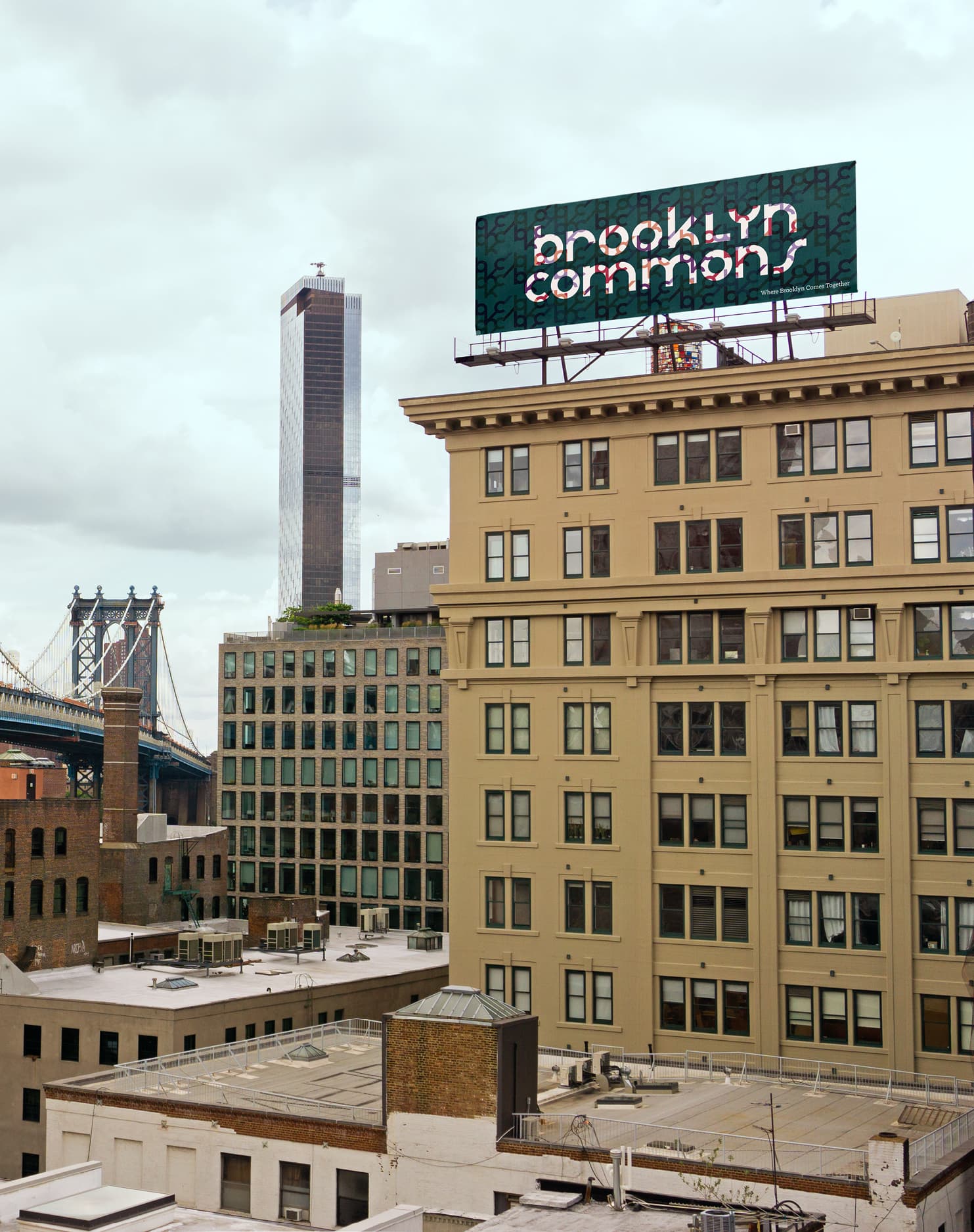
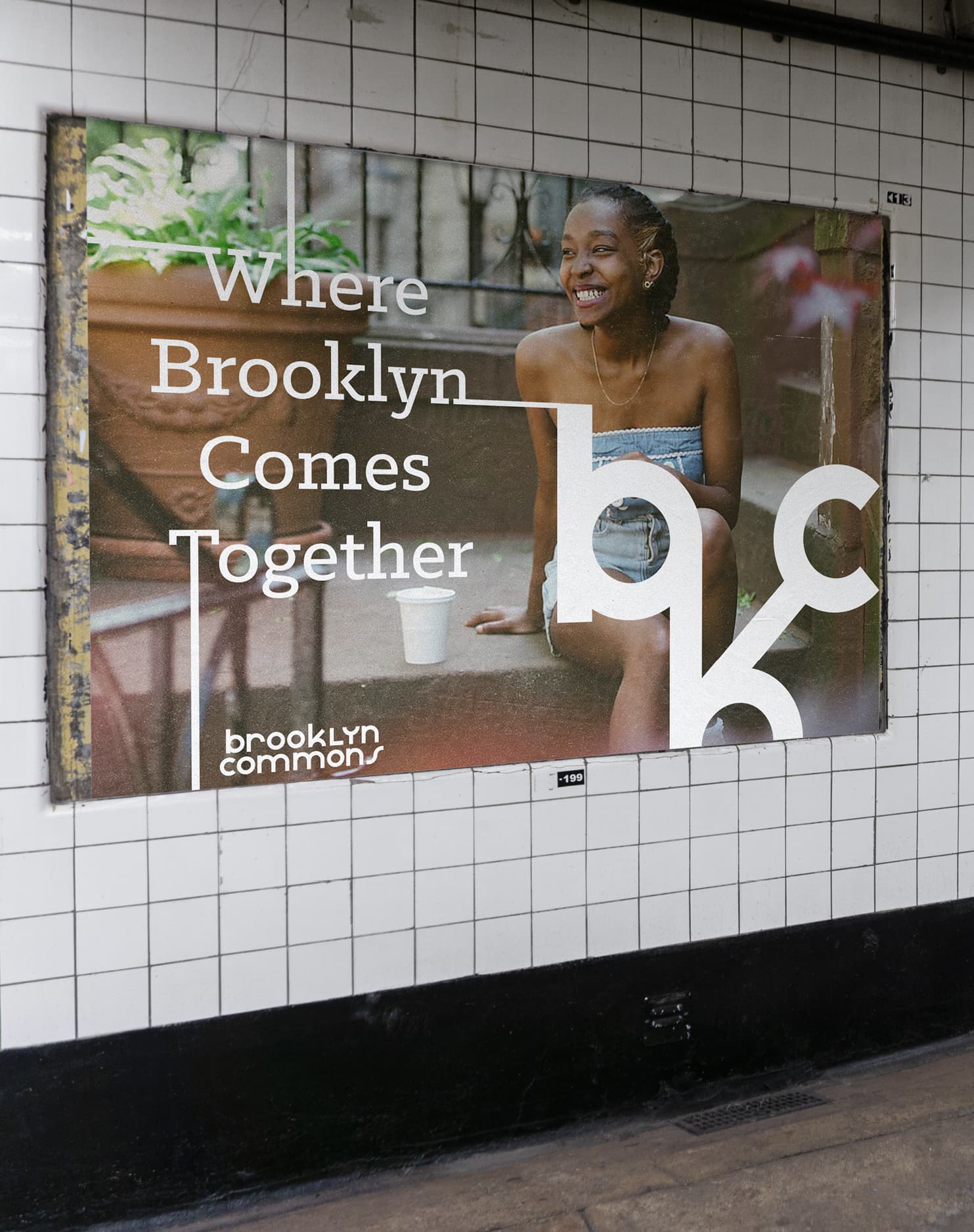
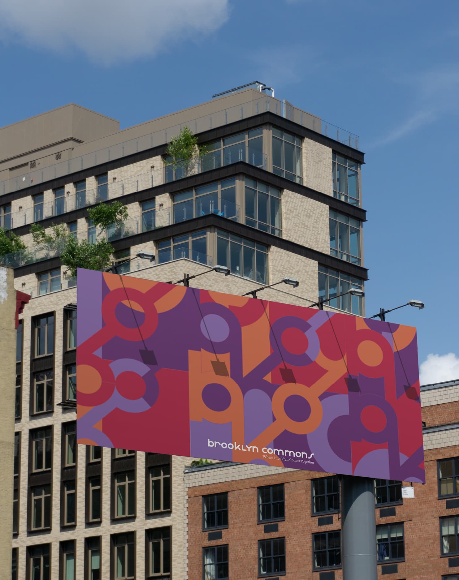
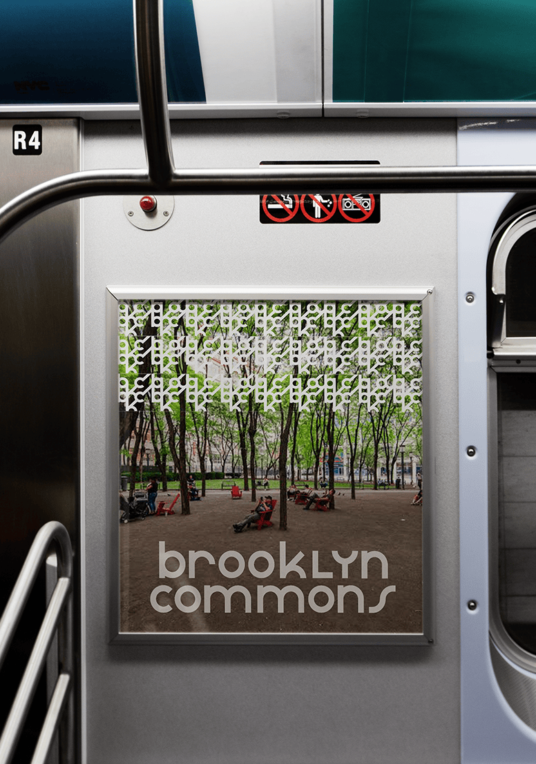
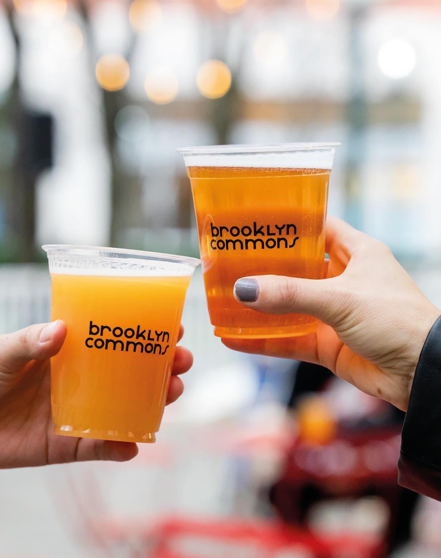
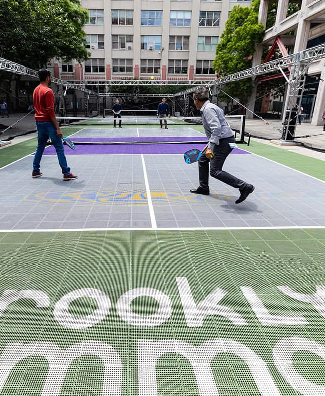
The depth of the visual system also allows the brand to extend naturally across social touchpoints, from content and campaigns to community events, making this more than an identity for a place. It’s a truly social brand, built to engage and grow alongside the community it serves.
Branding
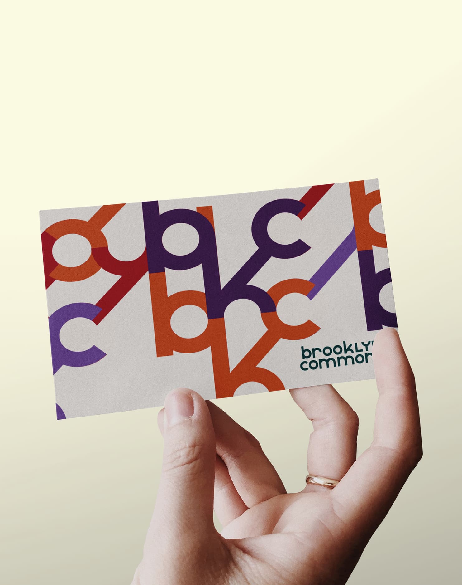
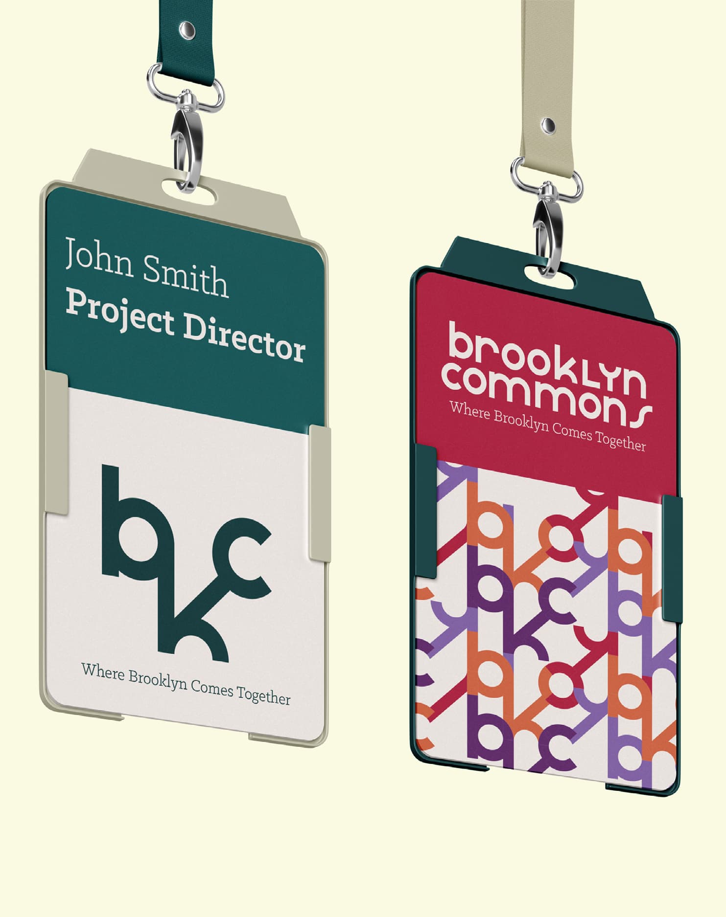
Card
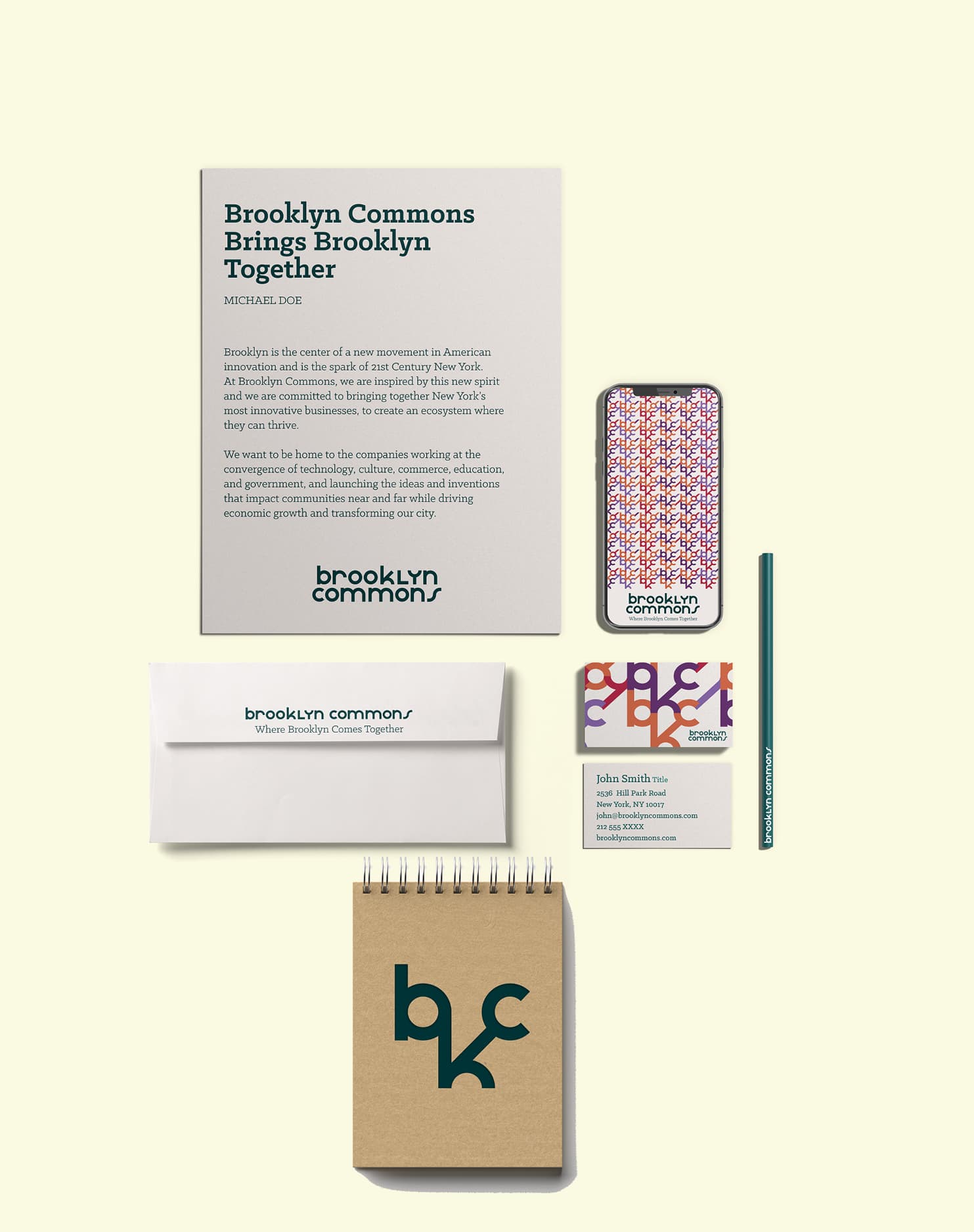
Stationary
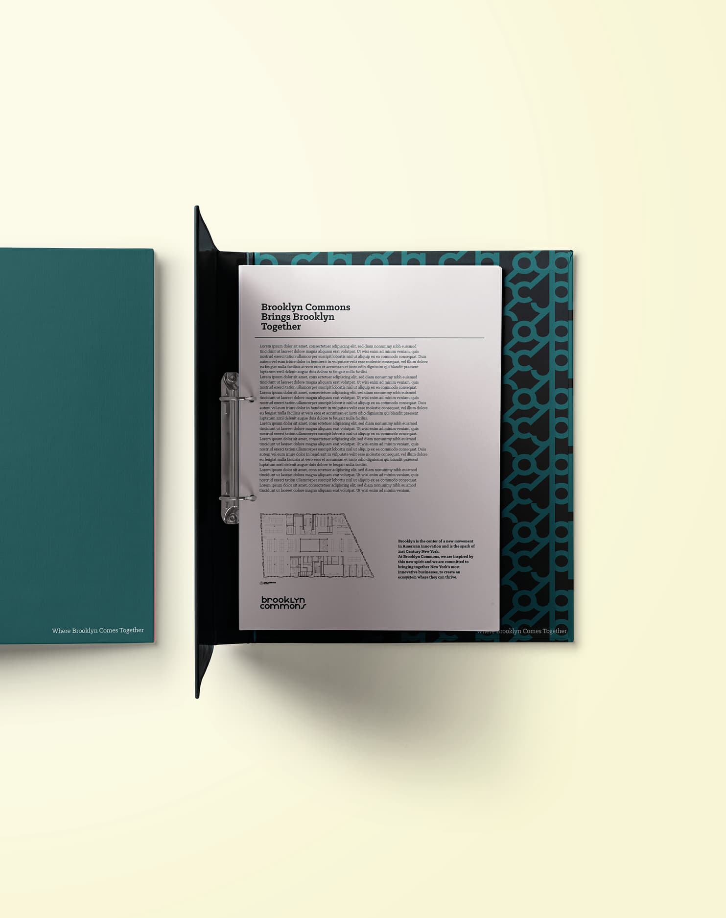
Tenant Folder

Impact
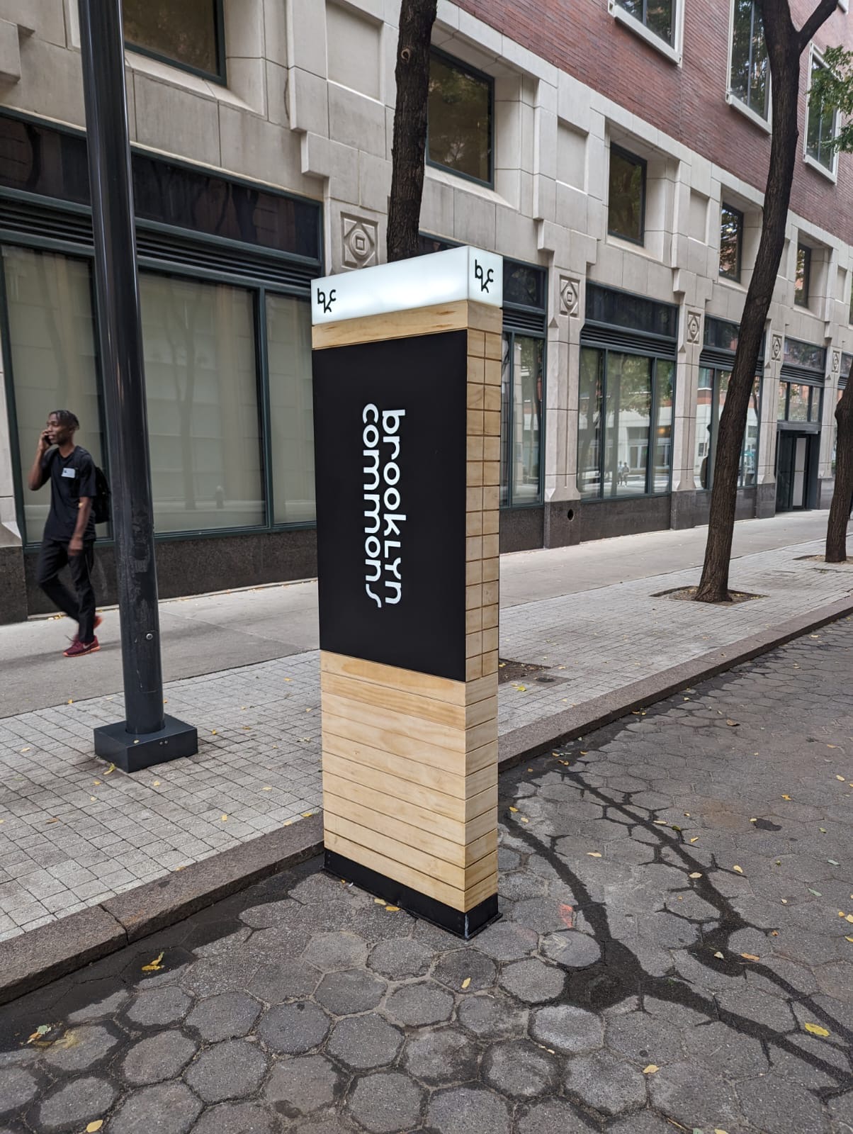
The new identity gave the site a cohesive visual language that signaled its shift from an insular office park to an open, community-facing destination.
Visual appendix



Related Projects
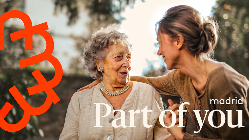
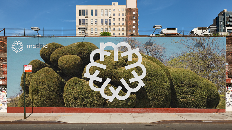
A proposal for communicating Madrid as a touristic destination far beyond the city itself. The identity was built to speak to Madrid's history and energy for an international audience, at a time when the city is undergoing a tourism renaissance.


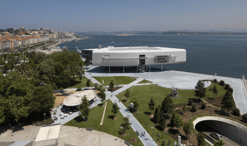
A contemporary art center on Santander's waterfront in Cantabria, hosting exhibitions, workshops, and public programs that engage a growing international and local audience, positioning it as a cultural anchor for the region and beyond.
Client: Fundación Botín
Location: Santander
Services: Identity, Place Branding, Signage & Wayfinding
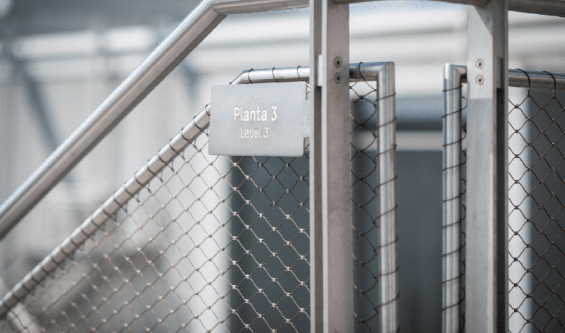
Signage & Wayfinding
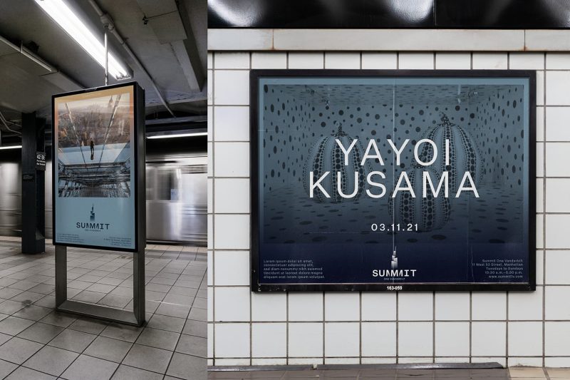
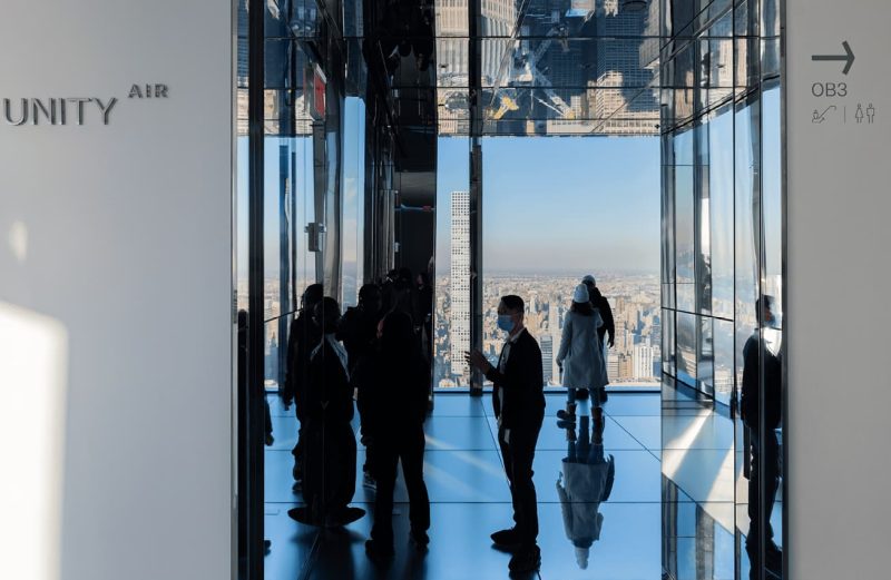
A multi-level observation experience within One Vanderbilt, rising above Grand Central Terminal, it features expansive views and mirrored art installations that make it more than an observation deck: an immersive cultural experience.
Client: SL Green Realty Corp.
Location: New York
Services: Campaigns, Identity, Place Making, Signage & Wayfinding
Colegio Madrid Fundación Santa María's identity and branding system centers on a refined, academic visual language that reflects the institution's blend of tradition and forward-thinking education. It combines a heritage-inspired crest and typography with a clean, modern color palette and layout system, ensuring consistency and recognition across all school communications, from signage to digital platforms.
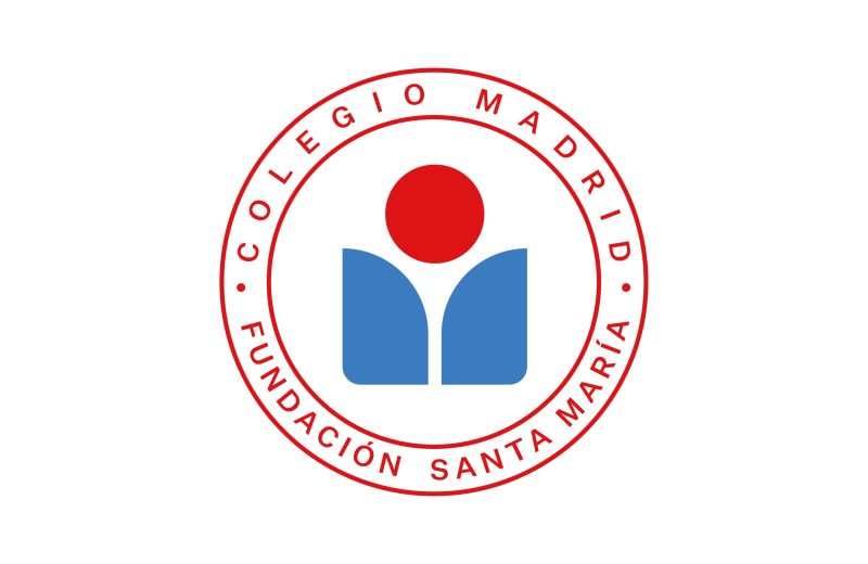
School Crest
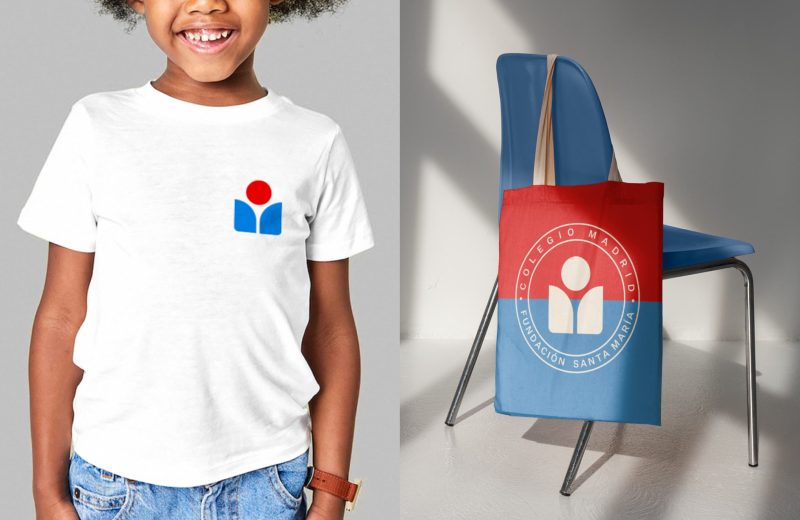
Formal and Informal uses
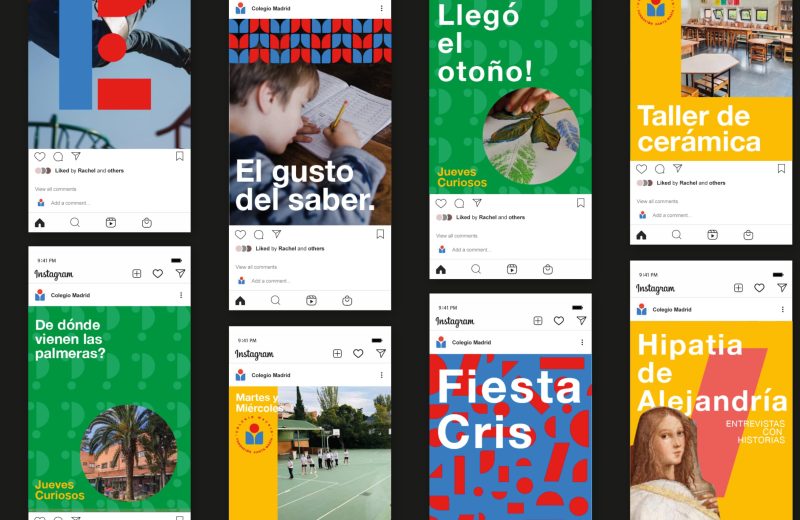
Visual System